

When Bell & Ross released their square cased BR 03-92 diver in 2018, I marvelled at how it was probably the only brand that could use the shape convincingly in a watch.
It is after all a brand that is famous for its range of square watches, with the use of the design of having a circular dial within a square case having begun from their iconic BR-01 of 2005. That watch was a revelation when it was first unveiled, showcasing an overtly technical attitude that would resonate with the aviation inspired theme that it represented.
The first BR 03-92 Diver, would carry on this attitude well, transferring it to the similarly technical activity of diving, and being right at home, among the necessary life saving equipment used in diving. The square shape would of course contribute via the straight purposeful lines that it was composed of, and with the addition of the rotating bezel, make this a diver that could very well have existed alongside the aviation themed BR-01 at the same time.
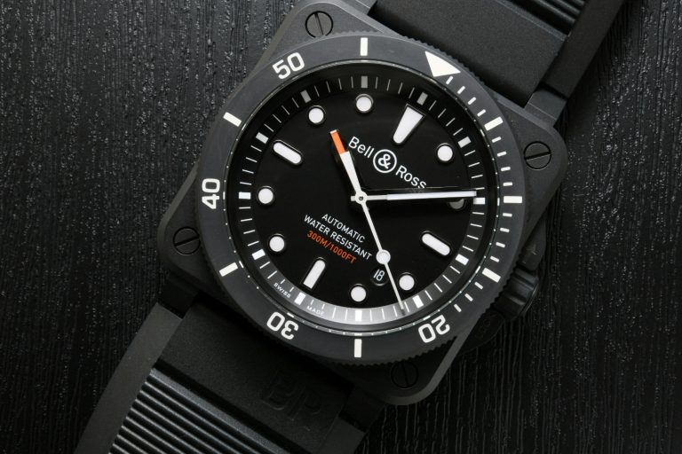
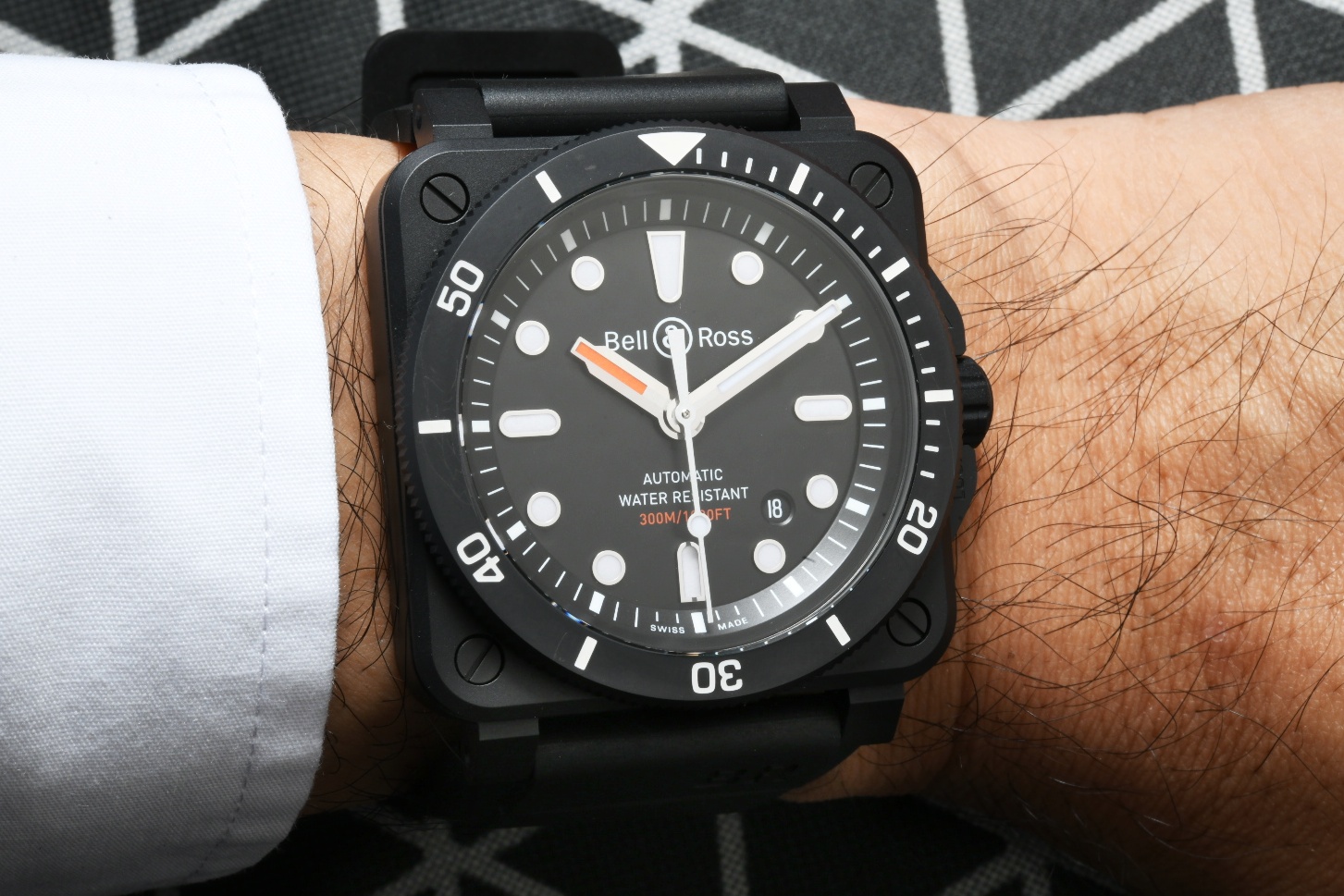 The initial BR 03-92 Diver watches were introduced in two variations of stainless steel and one in bronze. Last year in 2019 at Baselworld there was a new addition to the range, making a total of four references now. That claim to fame of that new addition, the BR 03-92 Diver Black Matte, distinguishes itself by having a case in black ceramic, coming all stealthy and cool, and looking just like the kind of watch that would fit well within the arsenal of a US Navy Seal.
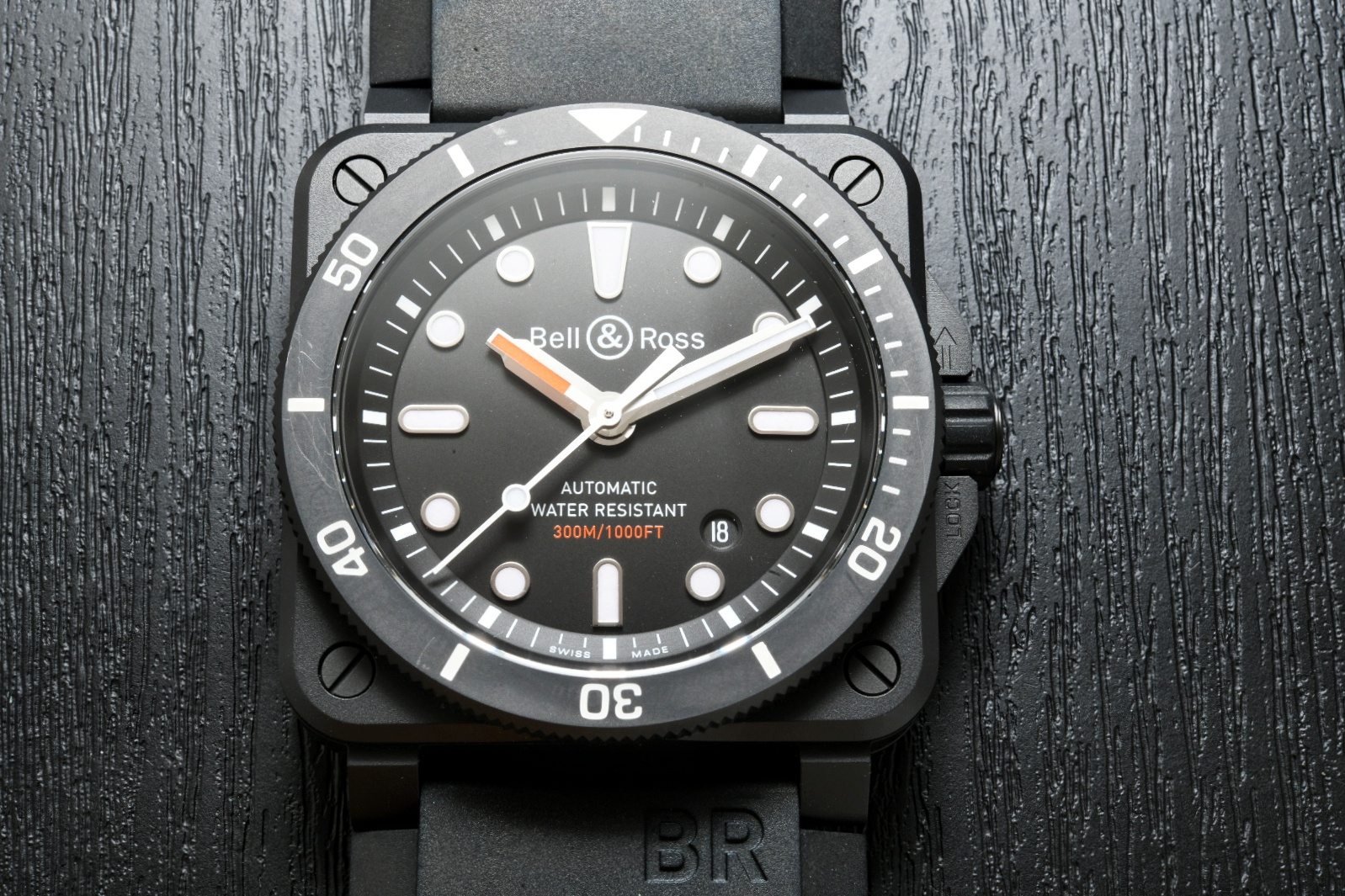
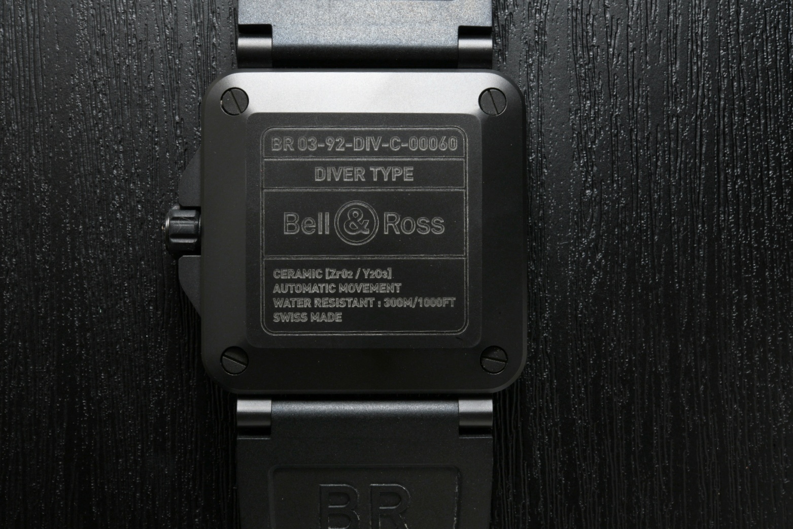 The Bell & Ross BR 03-92 Diver Black Matte is as stealth as they came, being composed of a black ceramic case, which explains the use of the term “Black Matte”, which in Bell & Ross parlance means matte black ceramic. Its anti-reflective nature, inspired from the use of matte surfaces in an airplane cockpit, adds to the purposeful feeling of the watch as well.
In this watch, the case and bezel are composed of the same black ceramic material, which allows the maintenance of a uniform feel through the entire watch, with only the white text on the bezel and white hour markers providing contrast for legibility. The only use of another colour comes in the form of orange that is in the hour hand and the text 300m/1000ft on the dial.
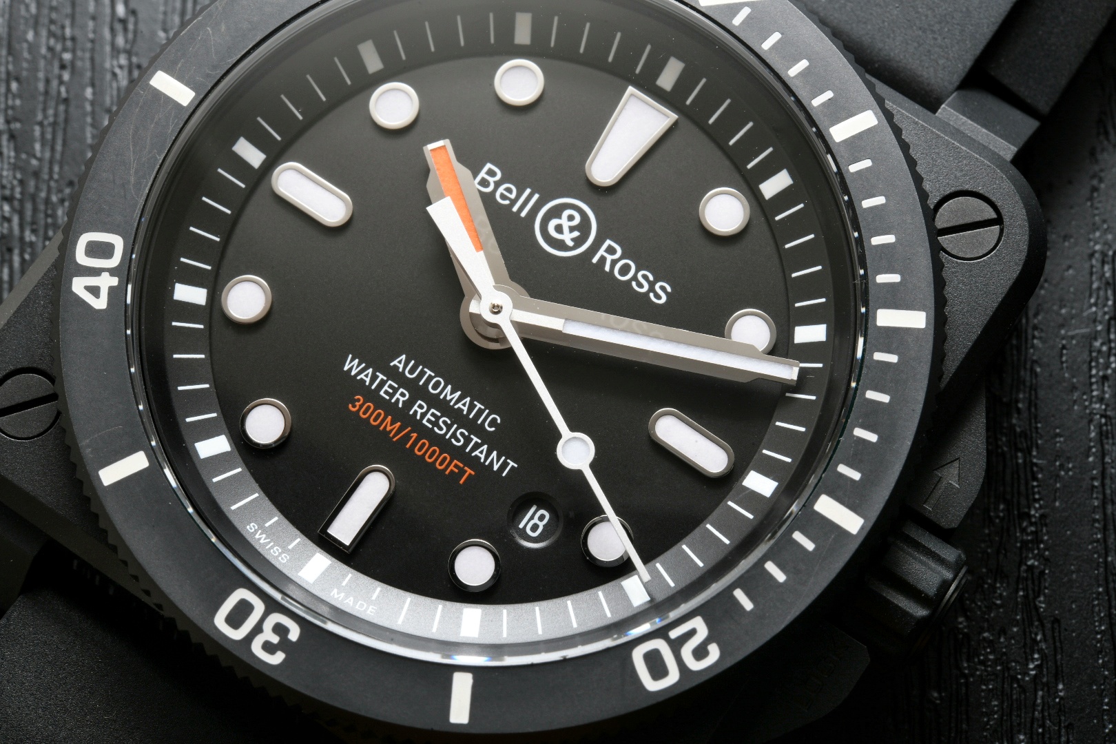 An interesting fact here, on why Bell & Ross probably chose orange for the hour hand – underwater, orange is the second colour to disappear after red, which makes the only truly visible hand the minute hand, which is all you need for timing duties underwater. Since typical dives don’t last more than 40 minutes, this allows a diver to fully concentrate only the minute hand used in conjunction with the bezel to time the dive.
In fact, have a look at the lume shot of the watch below and you’ll notice that the hour hand is not lumed at all. Why is this so? Well, it is the same reason why it is in orange. When the watch is used in the situation that it was designed for – diving – the hour hand is basically irrelevant. It’s nice to see how focused the design is in this context and makes us appreciate what Bell & Ross are trying to achieve with this little detail. 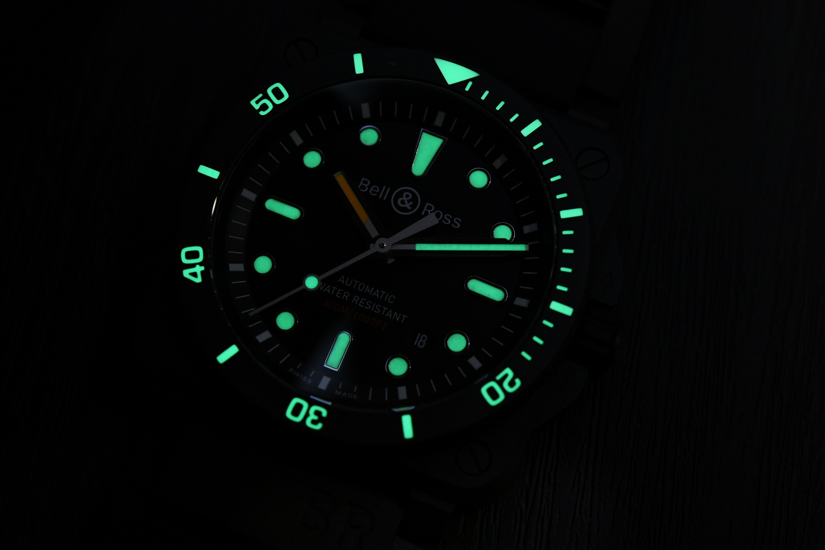 Overall, the Bell & Ross BR 03-92 Diver Black Matte is probably the one in the range I’d go for. I have a penchant for ceramic for its scratch-resistance, and the overall more monochromatic aesthetic is something that appeals as well. It’s just the coolest one out there now.
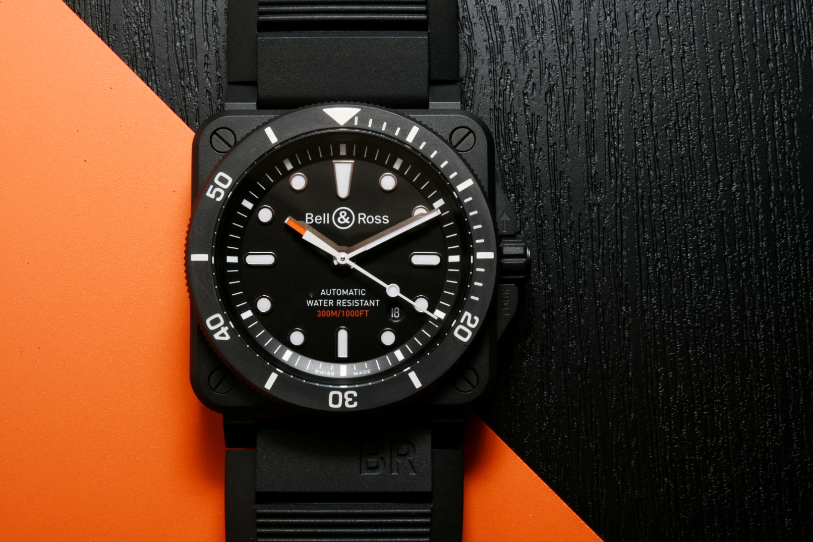
[ninja_tables id=”3869″]